CRED: AI credit transparency
User Testing, 0→1, Product design, UX Design

Tools
Figma, Mixpanel
Timeline
3 weeks
Device
Web
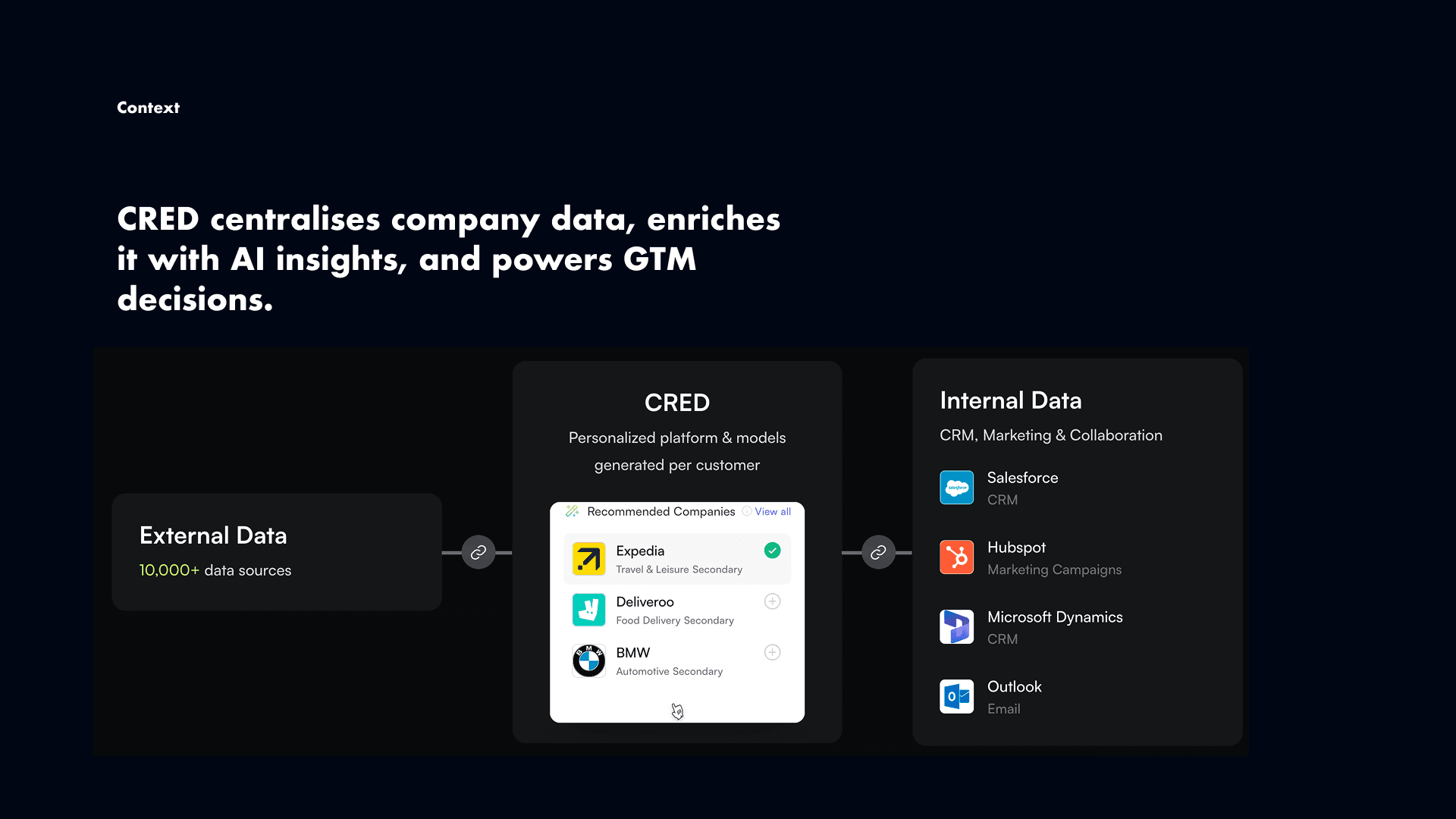
CRED is a B2B SaaS platform where everything runs on credits — syncing CRMs, running enrichments, powering AI automations. But the credit system was a black box.
The problem
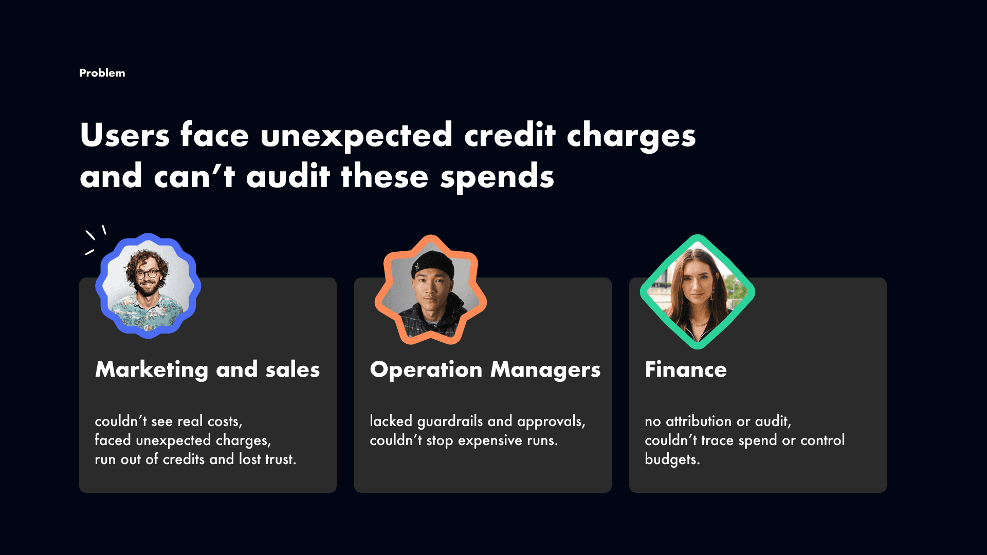
Users clicked "Enrich," credits disappeared, and no one could explain why. Support was flooded with the same ticket, over and over: "I don't know where my credits went." Trust was eroding. Adoption slowed. Retention was at risk.
The deeper I dug, the clearer it became — this wasn't one problem.
Sales users hated nasty surprises after clicking "Enrich." Ops managers had no way to stop someone burning thousands of credits in minutes. Finance leaders couldn't trace a single credit to a project or a person.
The same broken system was failing each group in a completely different way.
My goal: turn a black-box credit system into something transparent, predictable, and auditable.
Research
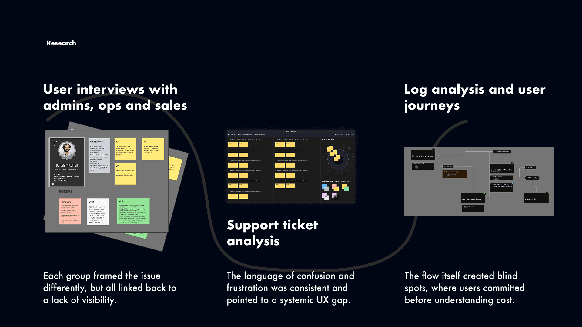
I combined user interviews, support ticket analysis, and log reviews. The phrase "I don't know where my credits went" appeared so often it stopped feeling like feedback — it felt like a symptom of something systemic.
The logs confirmed it. Cost information existed, but it was buried so deep that users were committing to expensive actions without ever noticing the price.
I brought all of this back to engineers, PMs, and finance stakeholders early. That alignment was key — we were designing for all three personas at once, not patching one pain point at a time.

From the research, I distilled everything into three principles that became the team's North Star:
Transparency — show the cost before the click, every time.
Guardrails — stop runaway spend, but never block people completely.
Attribution — every credit should have a story: who, what, and why.
—>
Designing the entry point
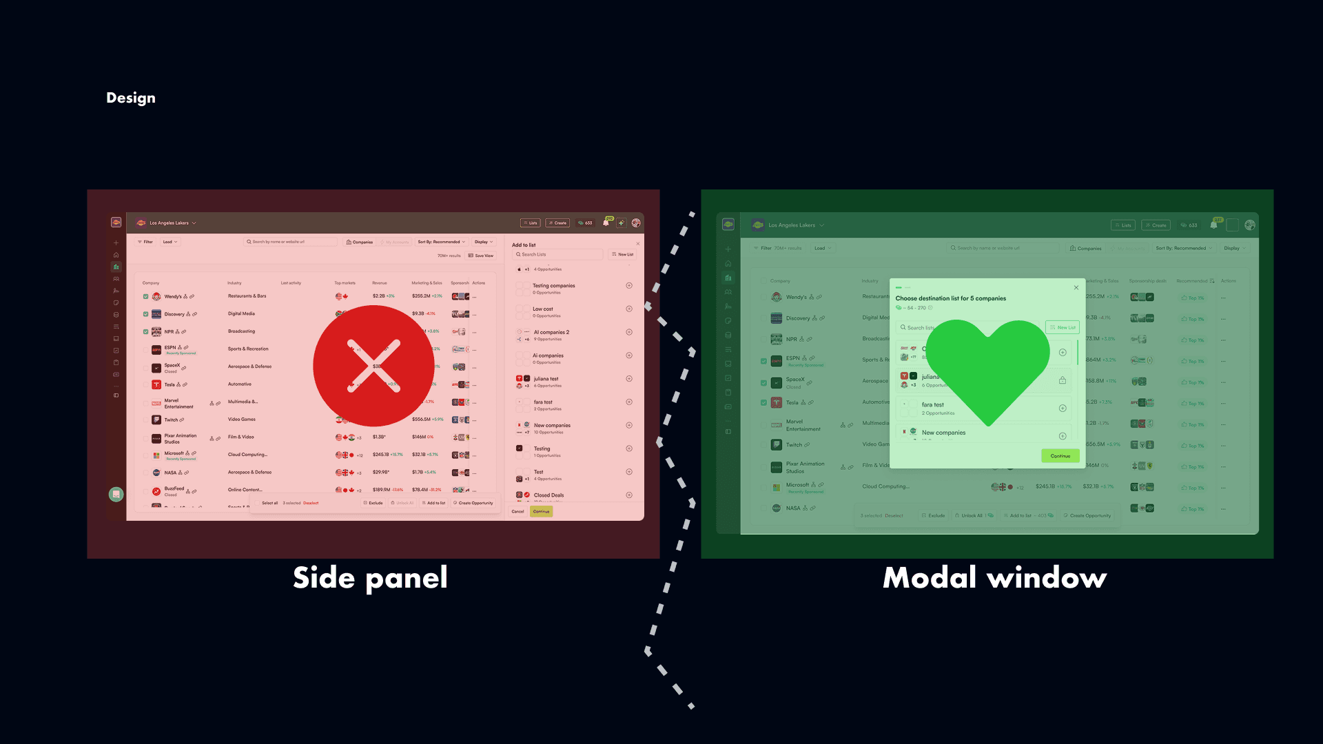
The biggest action in the system — bulk enrichment — lived inside a side panel. I pushed to move it into a modal, arguing that a high-stakes action needed a high-stakes container.
Not everyone agreed. So I ran a usability test: side panel vs. modal.
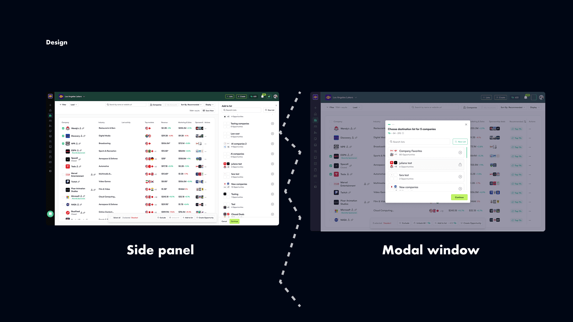
In the side panel, half of users skipped the cost information entirely. In the modal, nearly everyone paused, read the estimate, and adjusted their settings before running.
That data moved the conversation.
The modal became more than a confirmation screen — it became a decision cockpit. A live cost estimator showed the math in real time. Smart controls let users skip re-enrichment, limit to CRM entities, or defer enrichment entirely. Each control mapped directly to something we'd heard in research.
Guardrails without blocking

We tested three approaches: hard limits, approval flows, and soft warnings.
Hard limits killed productivity — users felt punished. Soft guardrails combined with manager approvals hit the right balance. Big jobs didn't slip through unnoticed, but users still felt in control.
We added scheduling too: if credits weren't available, users could queue the job and let it run automatically when limits refreshed. Marketers could set it and forget it.
Team leaders could configure the guardrails themselves — tuning thresholds, choosing between warn or block, and setting approval requirements.
Making every credit explainable
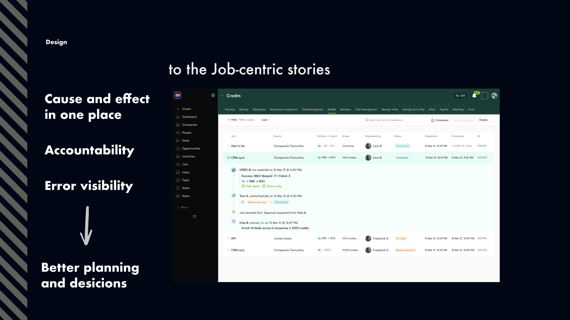
The original credit log was just a list of debits scrolling down a page. No context. No story.
We redesigned it around jobs, not transactions. Each job became a clear narrative: who triggered it, what was enriched, when it ran, how the estimate compared to actual spend, and what failed — with CSV exports for troubleshooting.
Finance could finally walk into budget meetings with a clean, defensible export. End users said they finally had peace of mind — they could see exactly what happened and why.
Results
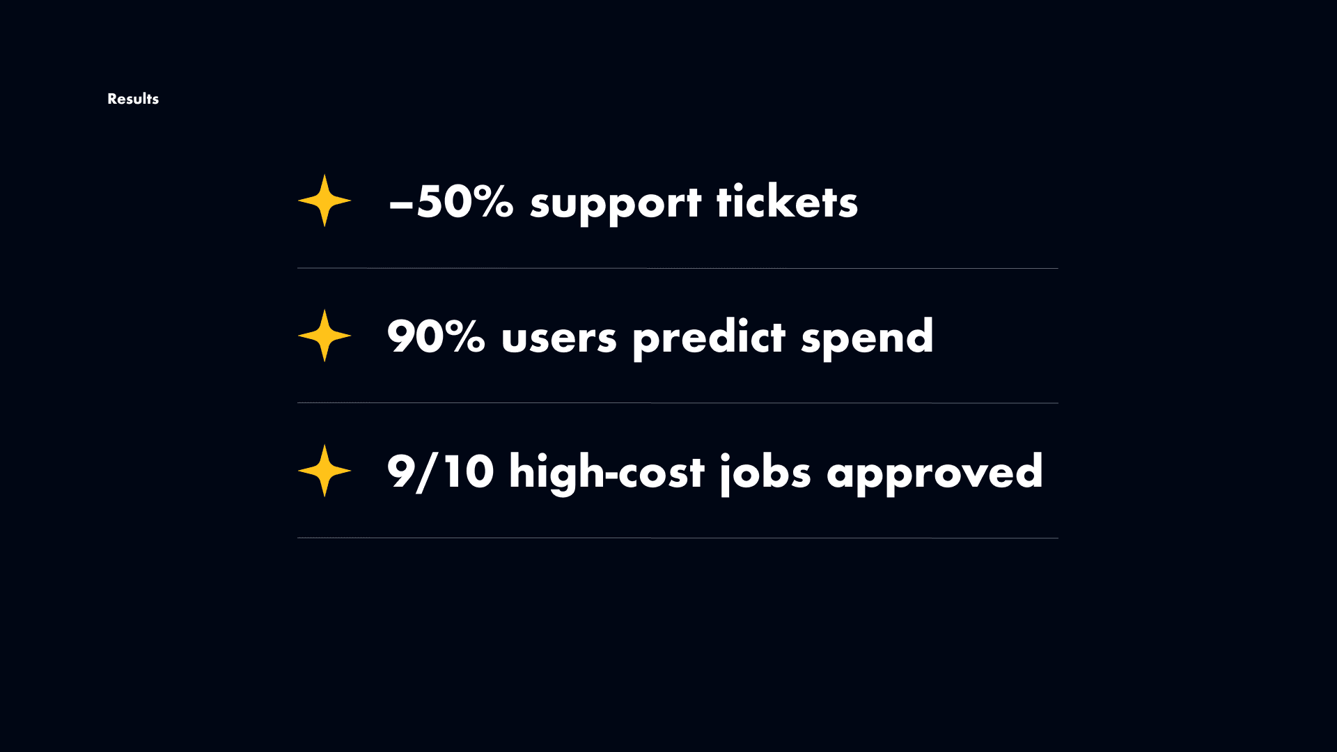
Support tickets about unexpected spend dropped by more than 50%.
~90% of users could accurately predict spend before running a job — up from under 50%.
Over 90% of high-cost jobs now go through approvals.
Finance gained full attribution: every credit traced back to a person and a project.
But the biggest outcome was harder to measure: users stopped fearing the credit system. It went from something unpredictable to something they could rely on.
What I learned
With high-stakes systems, design isn't just about the interface. It's about rebuilding trust — one decision at a time.