Unit-e: Trust into web 3.0
End-to-end design, 0->1, Design system, User research, Workshops, Design Sprint
Tools
Figma, LottieLab
Timeline
6 months
Device
iOS, Android
Unit-e is a peer-to-peer money transfer app aiming to simplify personal finance for everyday users. I led the design efforts for its MVP release, focusing on improving user trust and reducing friction in the core transfer experience. The project required a new design of the primary P2P flow, as well as the creation of a foundational design system to support rapid scaling.


Problem
User interviews and usability tests revealed three recurring themes that undermined the user experience:
Lack of clarity around transfer fees and steps
Low emotional engagement, leading to poor brand perception
Uncertainty about security, impacting confidence in taking action
These issues contributed to high drop-off rates, task failures, and low retention.
Business Goals
To support user growth and repeat engagement, the product team outlined three key goals:
Reduce friction and confusion in the transfer flow
Improve users’ perception of trust and clarity
Establish scalable UI foundations for future features
Research & Discovery
Methods & Approach:
To build a trust-first fintech experience, we ran a multi-pronged discovery phase using a combination of qualitative and competitive research methods:
Conducted 10 in-depth user interviews, focusing on mental models around digital money transfers, perceived trust signals, and pain points across the transaction journey.
Facilitated 2 cross-functional stakeholder workshops to map technical constraints, define measurable success metrics, and align on shared product goals.
Performed a competitive UX audit of top fintech products, benchmarking best practices in onboarding, transparency, real-time feedback, and microinteractions.
Analysed qualitative data using affinity mapping and synthesized patterns into actionable themes to inform design directions.
Key Insights:
Users demanded transparent, step-by-step guidance, especially during fee disclosures and transfer confirmation.
Lack of personalization created emotional detachment and reduced perceived value of the product.
Feedback loops and visible progress indicators significantly increased trust and task completion rates.
Design Process and Feature Prioritisation
Adopting a Lean UX mindset, we focused on rapid experimentation, user-centered iteration, and outcome-driven design.
Prioritised features using a RICE framework, balancing reach, impact, confidence, and effort.
Scoped MVP features and enhancements using MoSCoW prioritization to manage stakeholder expectations and ensure alignment between product and design.
Created low- and mid-fidelity prototypes in Figma, focusing first on trust-building steps (e.g. fee breakdowns, transaction tracking, and help prompts).
Ran 3 rounds of moderated usability tests using Maze and Figma prototypes, capturing both behavioral data and user sentiment.
Iteratively refined flows based on usability friction, and revalidated updated versions to ensure measurable improvement in user clarity and emotional trust.
This approach helped us reduce ambiguity early, build cross-functional buy-in, and ship a product experience that was both emotionally intelligent and compliant with fintech UX standards.

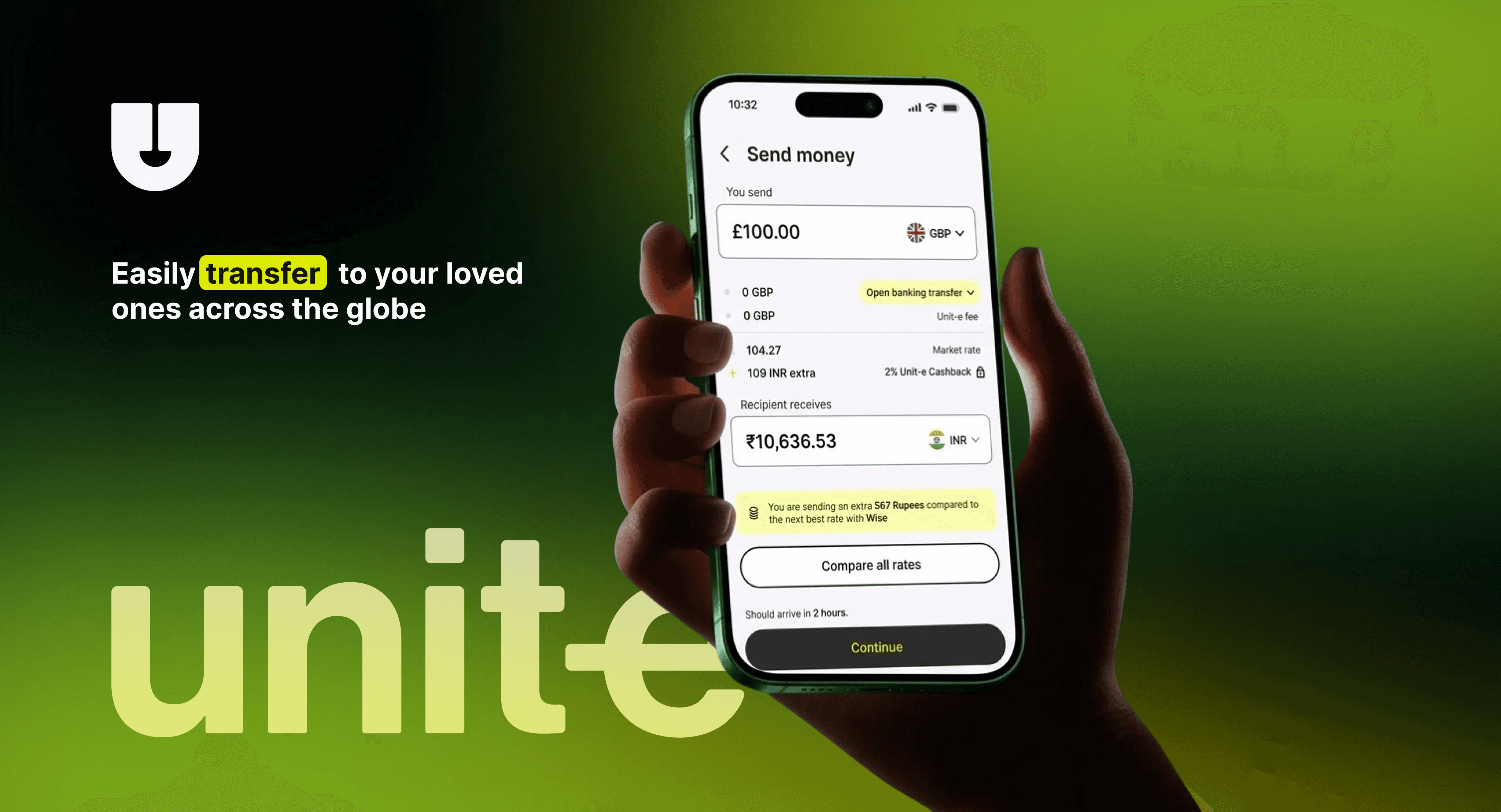
1. Transfer Flow Redesign
Replaced the generic form-based flow with a guided multi-step journey
Introduced inline fee previews, progress indicators, and microanimation-based confirmations
Simplified CTA hierarchy for decision-making

Impact:
25% faster task completion
2× increase in user confidence (self-reported)
40% reduction in usability-related errors
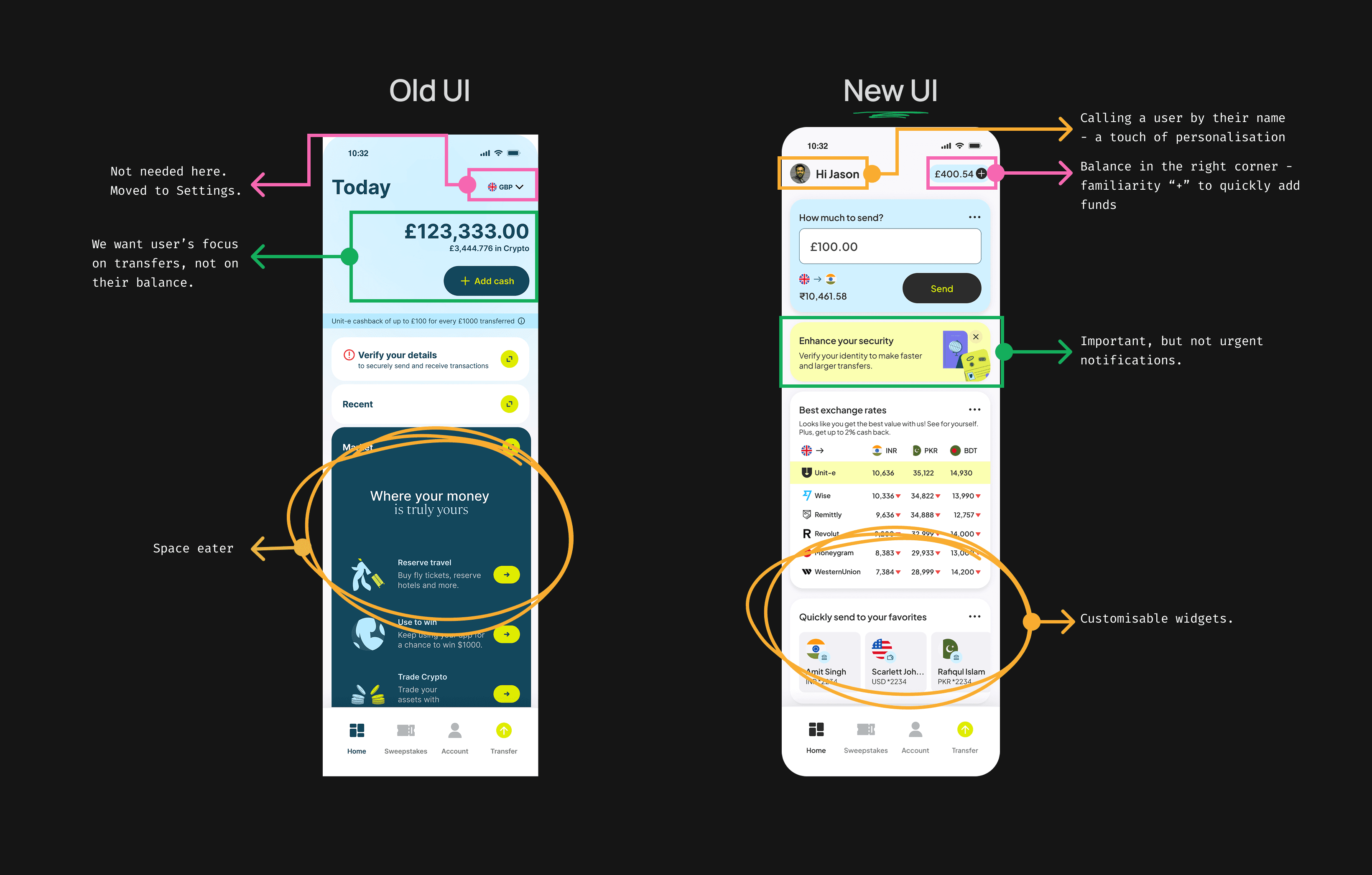
2. Personalisation & Control
During early research, it became clear that users lacked a sense of ownership over their experience and often felt emotionally disconnected from the product. They struggled to verify recipients and found the interface too generic for a product handling sensitive transactions.
To humanise the experience and strengthen clarity, I introduced personalisation features alongside a more intuitive payment method:
Why we did it:
Users were uncertain when sending money to unfamiliar contacts (e.g., phone numbers or emails)
There was no visual or emotional anchor within the app
Contextual clarity was missing in repeat-use cases like splitting bills or gifting
How we approached it:
Introduced tag-based payments, allowing users to send and receive money through unique identifiers (e.g., @jane.doe), reducing ambiguity and friction
Added support for custom usernames, avatars, and dashboard widgets, giving users more control over their environment
Designed quick-access panels for common actions and recent recipients to increase habit-forming usage

Impact:
Users described the experience as "clearer," "more human," and closer to messaging apps they trust
Improved performance in click-path mapping and tree testing
Greater engagement with the dashboard and repeat usage in testing groups
3. Visual Language & Accessibility
To reinforce the sense of trust and ease, I developed a modern design system that prioritised accessibility and emotional reassurance:
Clean typography and layout hierarchy
Accessible color contrasts for readability
Subtle animations to provide feedback without distraction
Impact:
Positive feedback on perceived professionalism and usability
Engineering team reported faster implementation and fewer inconsistencies
QA flagged significantly fewer visual or interaction-related issues


Constraints & Solutions
No analytics? → Added tracking to redesigned components
Tight deadlines? → Lean UX: test small, scale smart
No animation budget? → Built native animations in LottieLab
Outcomes
Fully redesigned P2P transfer flow launched with MVP
Tag-based payment system and personalization adopted as core features
Design system laid the foundation for future product scale
Clear improvements in user satisfaction, confidence, and navigation efficiency
Measuring success
To measure the success of the Unit-e redesign, we combined quantitative metrics, qualitative insights, and framework-driven evaluation.
We tracked key UX KPIs such as task completion time (25% faster), usability-related errors (40% reduction), and a 2× increase in user confidence using moderated usability testing and Maze surveys. Used the System Usability Scale (SUS), improving from 62 to 84, and gathered NPS-style feedback to gauge emotional trust, with scores rising from +14 to +38.
The HEART framework guided our measurement of happiness (confidence, sentiment), engagement (dashboard revisits, feature use), adoption (tag-based payments), and task success.
To prioritise features during the process, we applied the RICE framework, ensuring high-impact solutions, like inline fee breakdowns and personalisation, were delivered first. This Lean UX, data-informed approach helped us validate that our designs improved not just usability but emotional trust, engagement, and long-term product adoption.
Reflection
This project reaffirmed my belief that trust in fintech is not simply a product of security features but is cultivated through clarity, responsiveness, and emotional design. By aligning closely with engineering and product from day one, we were able to deliver meaningful improvements under pressure while setting the stage for long-term user engagement.