Cue: From research to prototype in one session

Tools
claude, figma
Timeline
6 hours
Device
mac, ios
I spent the first 45 minutes of every workday doing the same thing: opening Slack, then Jira, then Figma, then my calendar. Not because I wanted to. Because I had to reassemble context that should have been in one place.
So I designed Cue — an AI-powered async work companion that does that reassembly for you.
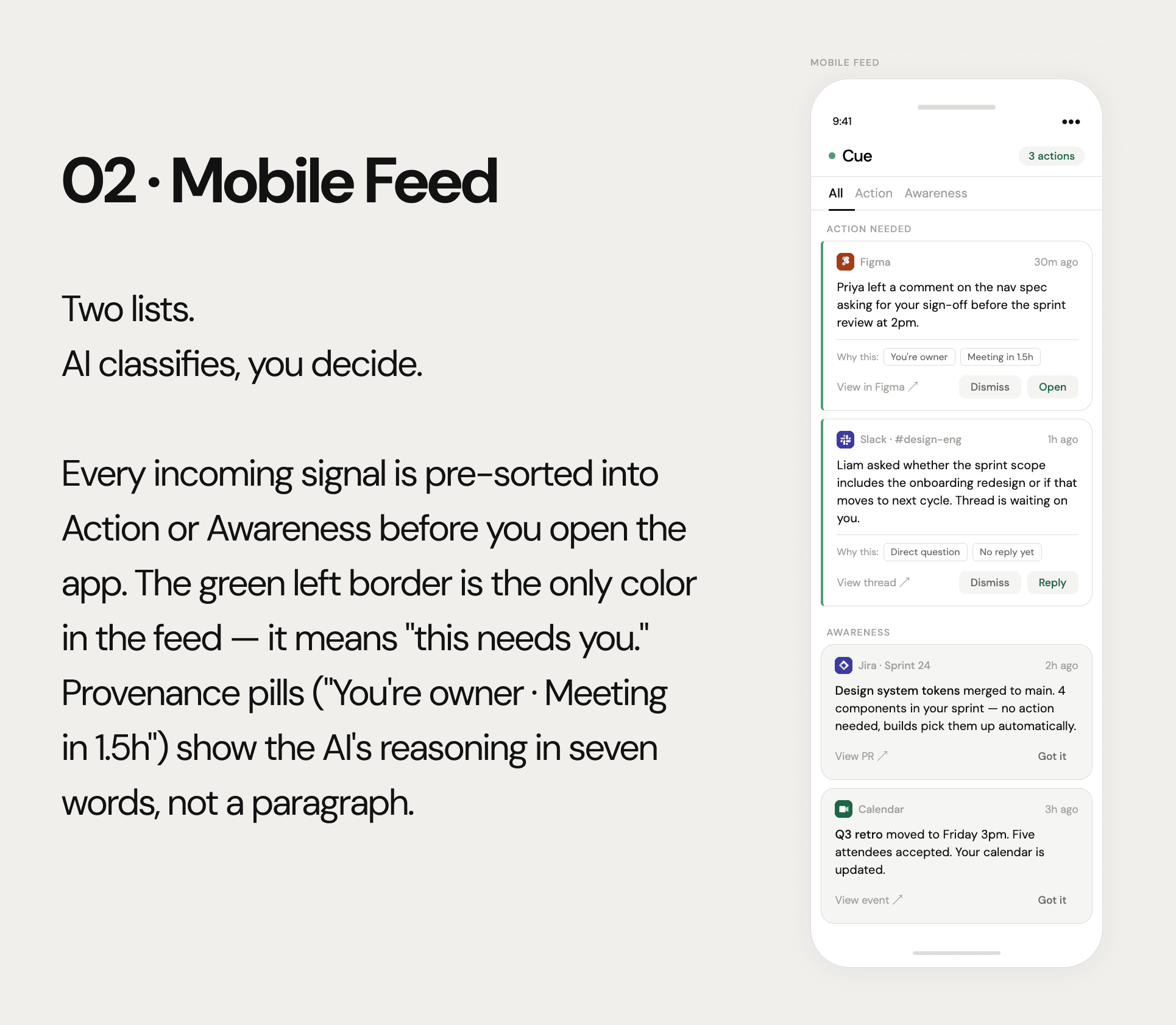
The core idea is deceptively simple: instead of a smarter inbox, build a classifier. Every signal from Slack, Jira, Figma, and your calendar gets sorted into two lists:
→ Action — things that need you
→ Awareness — things you should know
Try out the prototype
01 How This Was Made
This case study is the result of an experiment in AI-assisted design. The research, concept, UX decisions, and design direction are mine. The execution — screens, documentation, and this document — was built in collaboration with Claude (Anthropic’s AI) and pushed directly into Figma via the Claude + Figma integration.
The workflow looked like this: I defined the problem and research questions, conducted the interviews, synthesised the findings, and made every design decision. Claude helped me pressure-test those decisions, challenged weak reasoning, and accelerated the production of screens and documentation. The prototype in Figma was generated directly from our conversation — no manual file setup, no Figma template drag-and-drop.
Why be transparent about this: AI-assisted design is increasingly how product work gets done. Hiding it would be dishonest, and more importantly, it would miss the point: the quality of the output depends entirely on the quality of the thinking that directs it. The research is real. The decisions are mine. The speed is Claude’s.
02 The Problem
Cross-functional product teams operate across a growing number of async tools: Slack for communication, Jira for task tracking, Figma for design review, Google Meet and Notion for documentation. Each tool generates its own notifications, its own unread counts, its own context.
The result is a fragmented start to every workday. Before a single meaningful decision is made, knowledge workers spend 30–60 minutes doing triage: reading threads, checking ticket status, scanning comment feeds. The cognitive cost is invisible on a calendar but real in practice.
The core failure: Every tool optimises for its own signal. None optimises for the person receiving all of them at once.
Cue is designed to solve this. It aggregates signals from Slack, Jira, Figma, and calendar events, processes them with AI, and surfaces them as two lists: what to know, and what to do. The goal is to give users their first 30 seconds of clarity before the workday begins.
03 Research
Method: Expert interviews
Rather than a longitudinal diary study, I conducted structured expert interviews with three specialists who use async tools as a core part of their daily work:
A product designer at a mid-size SaaS company, managing design reviews across Figma and coordinating with engineers via Slack and Jira.
A product manager at a fintech startup, responsible for sprint coordination, stakeholder updates, and cross-team dependency tracking.
A senior software engineer at a remote-first company, balancing code reviews, Jira ticket management, and Slack-based technical discussions.
Each interview lasted 45–60 minutes. I asked participants to walk me through their first hour of a typical workday in real time — sharing their screen and narrating their decisions as they made them. This gave me behavioural data, not self-reported data.
What I heard
“I have a system — I check Slack first, then Jira, then Figma. But the system only works if nothing urgent has happened across all three at the same time. Which is every Monday.” — Product designer
“Half my Slack checks are just reassurance. I’m not looking for something specific. I’m checking because I’m worried I missed something.” — Product manager
“The worst part is context-switching mid-ticket. Someone pings me in Slack about a Jira ticket while I’m reviewing a PR. Now I’m in three places at once and none of them properly.” — Senior engineer
Synthesised findings
All three participants had a personal triage ritual they’d developed organically. None of it was fast. All of it was manual.
Figma comments were consistently the most missed signal — they don’t integrate into Slack or Jira and have no urgency signal.
The distinction between “I need to act on this” and “I just need to know this happened” was something all three participants made constantly — but no tool helped them make it.
Context collapse was the most stressful scenario: a Slack thread referencing a Jira ticket referencing a Figma file required opening all three to understand what was being asked.
The design insight: The problem is not notification volume. It’s that no tool separates signal from action. Users classify every notification manually, every morning, across every surface. Cue should make that classification disappear.
04 Key Design Decisions
Decision 1: Two lists, not a better inbox
The earliest explorations trended toward a unified inbox with smart filters. The research killed that direction quickly. Filters put the classification work back on the user. The entire value of Cue is that AI does the classification before the user opens the app.
We landed on two named lists: Action (requires your input) and Awareness (things that happened that you should know). Everything incoming gets assigned to one of these. The user’s first interaction with Cue is not “let me sort through this” but “what do I need to do?”
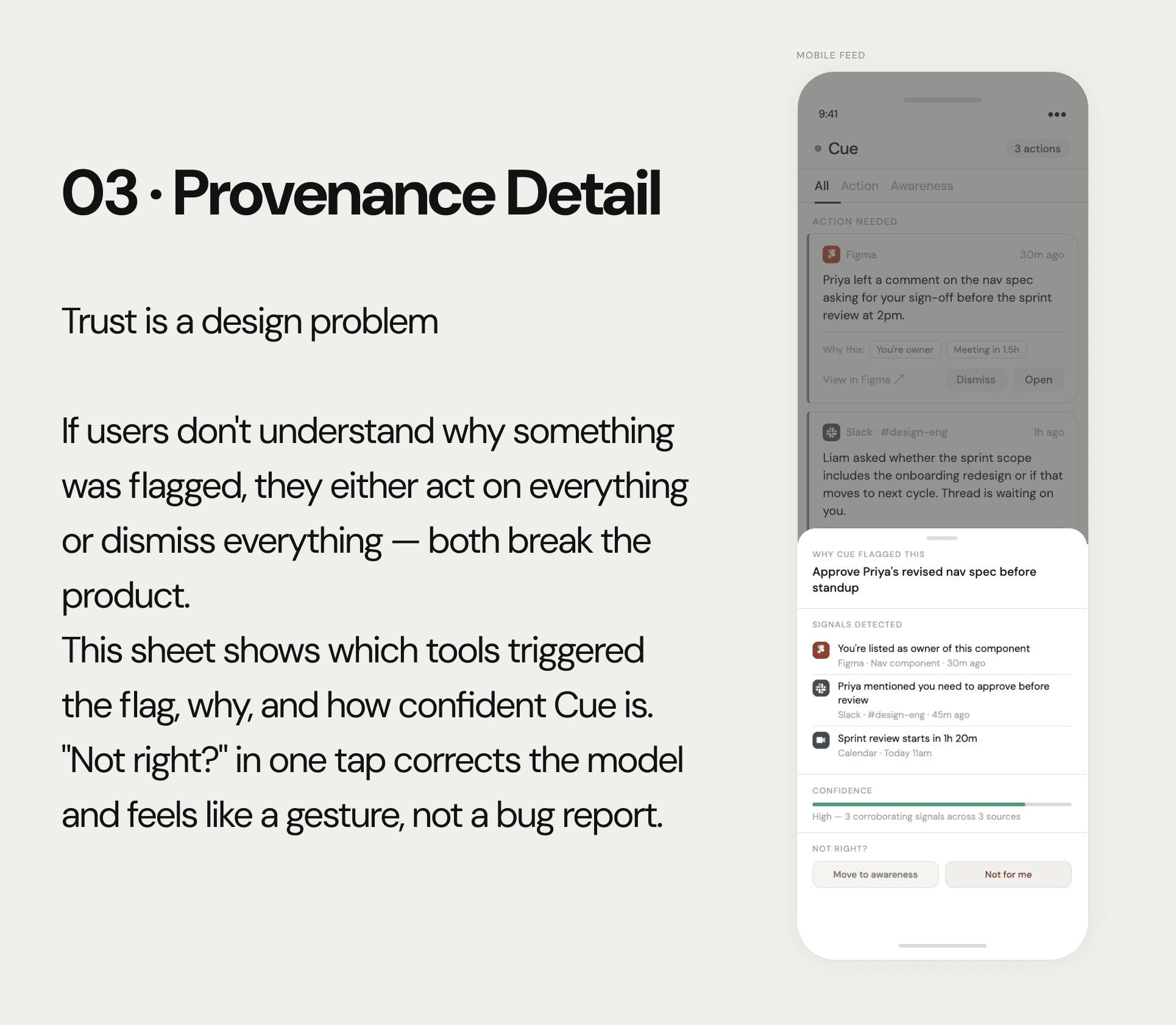
Decision 2: Provenance, not black-box AI
Every action item surfaces its reasoning: which signals Cue detected, from which sources, and a confidence indicator. This was a direct response to the trust problem. If a user doesn’t understand why something was flagged as an action, they either act on everything (defeating the purpose) or dismiss everything (same result).
Reclassification is built into every item: “Move to awareness” and “Not for me.” Every reclassification is a training signal. Cue gets better as users correct it.
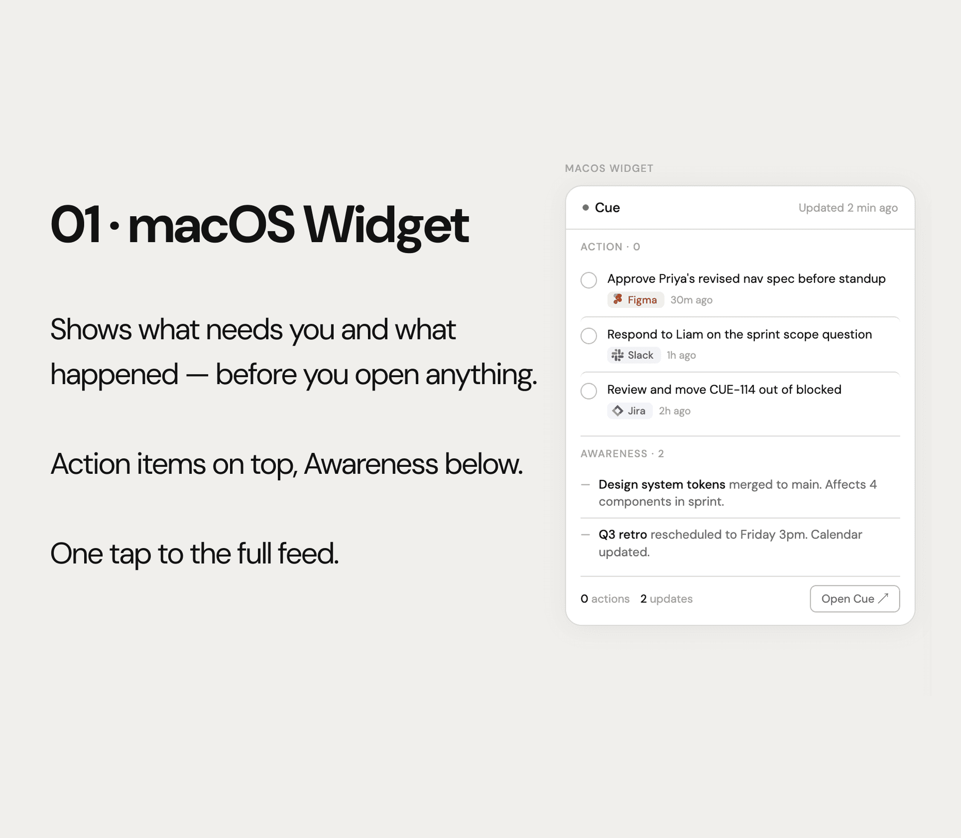
Decision 3: The widget is a traffic light, not an inbox
The macOS widget shows one number and three headlines. It is not interactive beyond opening the full app. Every attempt to add inline actions made it feel like a notification panel — which is exactly what Cue is trying to replace.
The design principle: the widget tells you whether you need to open the app. The app tells you what to do.
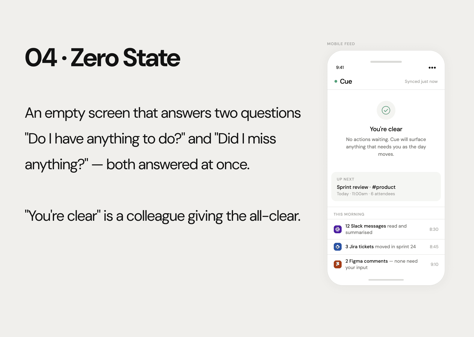
Decision 4: The zero state does emotional work
The PM interview surfaced something important: a significant portion of tool-checking is anxiety-driven, not intent-driven. People open Slack not because they have something to find but because they’re worried they missed something.
Cue’s zero state addresses this directly. “You’re clear” answers the action question. The morning digest (“12 Slack messages summarised”, “2 Figma comments — none need your input”) answers the anxiety question. Both are necessary.
Copy as design: “No items” and “You’re clear” carry identical information. One feels like a system state. The other feels like a colleague who read everything so you didn’t have to.
05 The AI Layer
Cue’s AI has three jobs, in order of importance:
Classify: Action or Awareness. This is the core product decision, made automatically for every incoming signal.
Summarise: compress a 40-message thread into one sentence that preserves the decision made, if any, and who made it.
Connect: identify when a Figma comment, a Jira ticket, and a Slack thread are about the same topic — and surface them as one item, not three.
The third job is the differentiator. Every tool in the category can summarise within its own silo. Only a cross-tool intelligence layer can notice that the Slack thread about “nav redesign,” the Figma comment on “Header v3,” and the Jira ticket “CUE-114” are the same conversation. Surfacing that as a single, coherent action item is what makes Cue feel like an intelligence layer rather than an aggregator.
06 Screens
Four screens form the complete user journey. All four were built directly in Figma via the Claude + Figma integration during our design session.
macOS Widget — glanceable count and top three action items. One tap opens the mobile app.
Mobile Feed — full-context cards with source attribution, provenance pills, and per-item action buttons. Tabs for All / Action / Awareness.
Provenance Detail (bottom sheet) — signals detected, source timeline, confidence bar, reclassification controls.
Zero State — “You’re clear” hero + morning digest of what Cue processed while the user was away.
Visual language: one accent color (green, used exclusively for the action state). No gradients. No shadows in the widget. DM Sans for a slightly warmer tone than system defaults. The quieter the interface, the more it disappears into the workflow — which is where a work companion belongs.
07 What’s Honest About This Concept
This is a concept, not a shipped product. The honest constraints are:
Onboarding: granting Slack, Jira, Figma, and calendar permissions is a significant trust ask. That flow hasn’t been designed.
AI accuracy: the trust model only works if classification accuracy is above ~90%. That requires real data and iteration.
Notification fatigue: Cue could become another notification source if not tuned carefully. Push vs. pull delivery model needs its own design pass.
The interviews were three people. Broader validation would likely surface edge cases and personas not captured here.
I’ve named these because a senior design portfolio should show that you understand the gap between a good concept and a shippable product. This is a strong concept. The work to make it a product is real and separate.
08 Reflection
The most important moment in this project was the decision not to build an inbox. Every early instinct pointed toward a smarter, more organised feed. The PM interview broke that instinct: she wasn’t checking Slack because she had work to do. She was checking because she was anxious she’d missed something. That’s a different problem, and it needs a different answer.
Working with Claude as a design partner accelerated the execution significantly — screens that would have taken a day were built in an hour. But more valuably, having an interlocutor that pushed back on weak reasoning made the concept sharper. The Awareness / Action split, the provenance layer, the zero state copy — all of these were pressure-tested in conversation before a single frame was built.
The principle behind Cue: The best work tool is the one you stop noticing. Cue should feel less like software and more like a trusted colleague who read everything overnight so you can start your day with a clear head