Topvisor: user-centric SaaS
User Testing, 0→1, Product design, UX Design

Tools
Figma, Jira, Github
Timeline
6 months
Device
Web, Mobile
Competitor Research Tool at Topvisor
Topvisor is a suite of SEO tools built around website projects. It’s mainly used by SEO specialists and agencies for rank tracking, audits, and reporting.
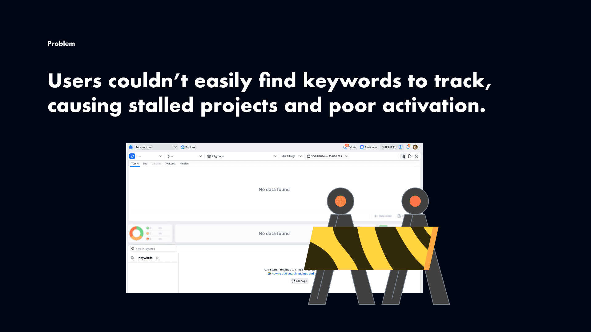
Our core product was Rank Tracker, but users kept hitting the same problem: they didn’t know which keywords to track. Without keywords, projects stalled before users could see any value.
So we decided to build Competitor Research — a tool that could automatically pull keywords, reveal competitor strategies, and surface opportunities. This was not only about solving a pain point. It was also a way to make Topvisor a more complete SEO suite and help it compete with much larger players.
Research
To design the right solution, I looked at both the market and our users.
On the market side, I studied tools like SEMrush, Ahrefs, and SimilarWeb. They all provided huge keyword lists, but they did little to help users structure that data or move through onboarding. That showed a clear gap: users did not need more data, they needed a better way to use it.
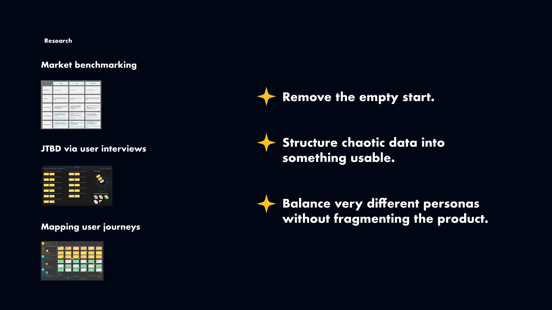
Then I interviewed our two main audiences.
SEO specialists wanted control: filters, clustering, and automation, because they worked with large datasets and client projects.
Small business owners wanted clarity. They didn’t care about thousands of rows. They wanted to quickly understand what competitors ranked for and where their own gaps were.
When I mapped their journeys, two pain points stood out. For SMBs, the biggest blocker was the empty start — they simply didn’t know what to enter. For SEO specialists, the problem came later, when the data arrived in a format that was too messy to act on.
I brought these insights back to the team and worked closely with engineers, the PM, and the CEO. We reviewed options together, discussed trade-offs, and aligned on the direction.
Core challenges
Three major challenges shaped the design.
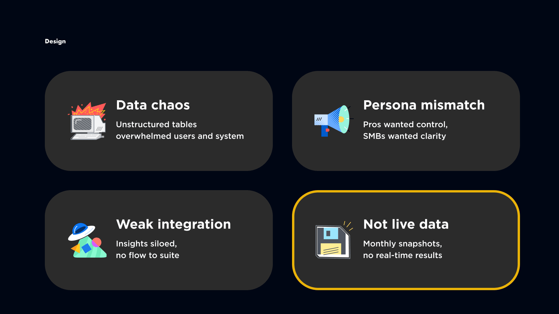
First, the data was overwhelming. Early concepts relied on large flat tables with thousands of keywords. That confused beginners, slowed down power users, and created performance issues.
Second, we had to serve two very different audiences in one product. Specialists wanted depth and control, while SMBs needed simplicity and guidance.
Third, the tool initially felt disconnected from the rest of the suite. Even if users found useful keywords, moving them into Rank Tracker required manual work, which broke the flow.
There was also a technical limitation around data freshness. We initially wanted to offer live competitor data, but engineering made it clear that at scale we could only support monthly snapshots.
Design Challenges
Once we started prototyping, several challenges became clear.
First, data chaos. Early versions dumped thousands of keywords into flat tables. Beginners froze, power users struggled to parse the data, and performance suffered.
Second, persona tension. SEO specialists wanted control and depth, while SMBs wanted simplicity and guidance. Creating two separate tools wasn’t an option — we needed a single system that could flex.
Third, integration. Competitor Research initially felt isolated. Moving keywords into Rank Tracker required manual copy-paste, breaking the end-to-end flow.
Finally, data freshness. We originally aimed for live competitor data, but at scale, crawlers could only provide monthly snapshots. This felt like a major limitation at first.
Close collaboration shaped how we handled these constraints. Engineers flagged performance risks early, the PM balanced business priorities, and even the CEO participated in design reviews. Problems surfaced early — and directly informed the solutions.
Product Design Strategy
We used Lean UX and RICE to manage velocity and business value. The foundational design strategy focused on clarity through progressive disclosure, exposing the right insights at the right time without overwhelming users.
The interface emphasised:
SERP-based keyword clustering, grouping domains by real-world visibility patterns
Preview cards of real search results, enriched with organic and ad placements
Color-coded visual tables and compact filters for engine/device/context — all scoped to avoid global resets

As this was a greenfield project, I ran collaborative deep thinking workshops to ensure we were building the right product.
Solution
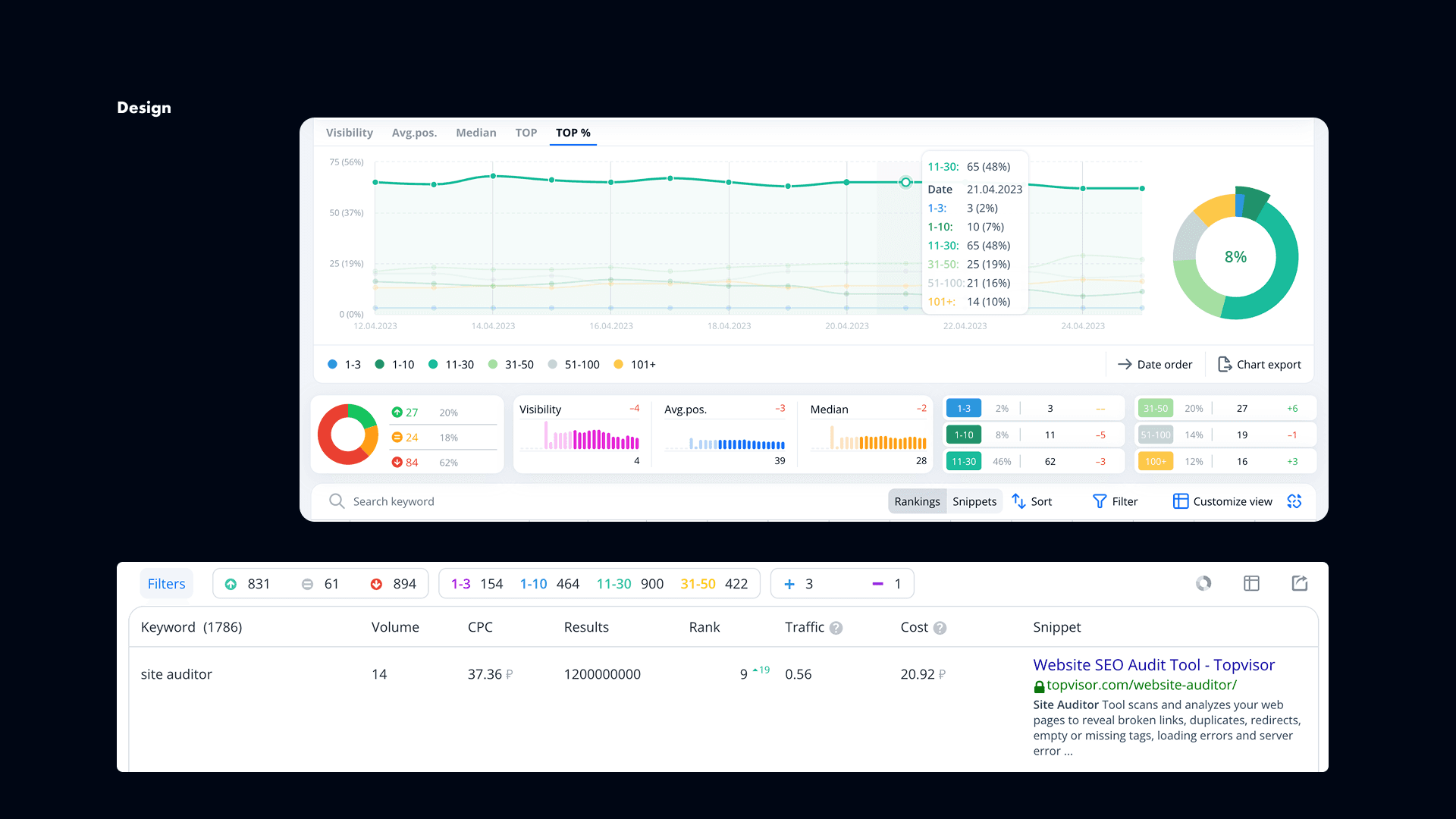
We redesigned the tool around structured reports instead of raw tables.
Users selected a search engine, region, and month, then entered either a URL or a keyword. From there, the results were split into clear views.
For URL-based reports, users could explore keywords, site structure, and competitor insights.
For keyword-based reports, they could see related queries, word forms, and market leaders.
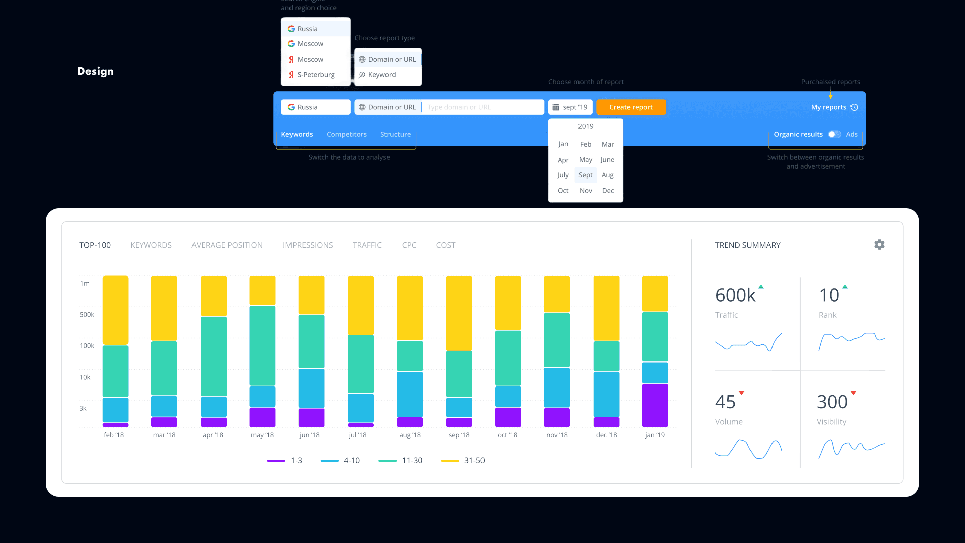
To reduce overwhelm, I introduced clustering, progressive disclosure, and smart filters. That made the experience much clearer for beginners, while still giving specialists enough flexibility to work deeply with the data. It also helped engineering by reducing system strain through progressive loading.
To support both audiences in one flow, we designed one interface that could flex in different ways. Specialists could use filters and controls to work quickly at scale, while SMBs could rely on simpler visual summaries and lightweight graphs to understand the data at a glance.
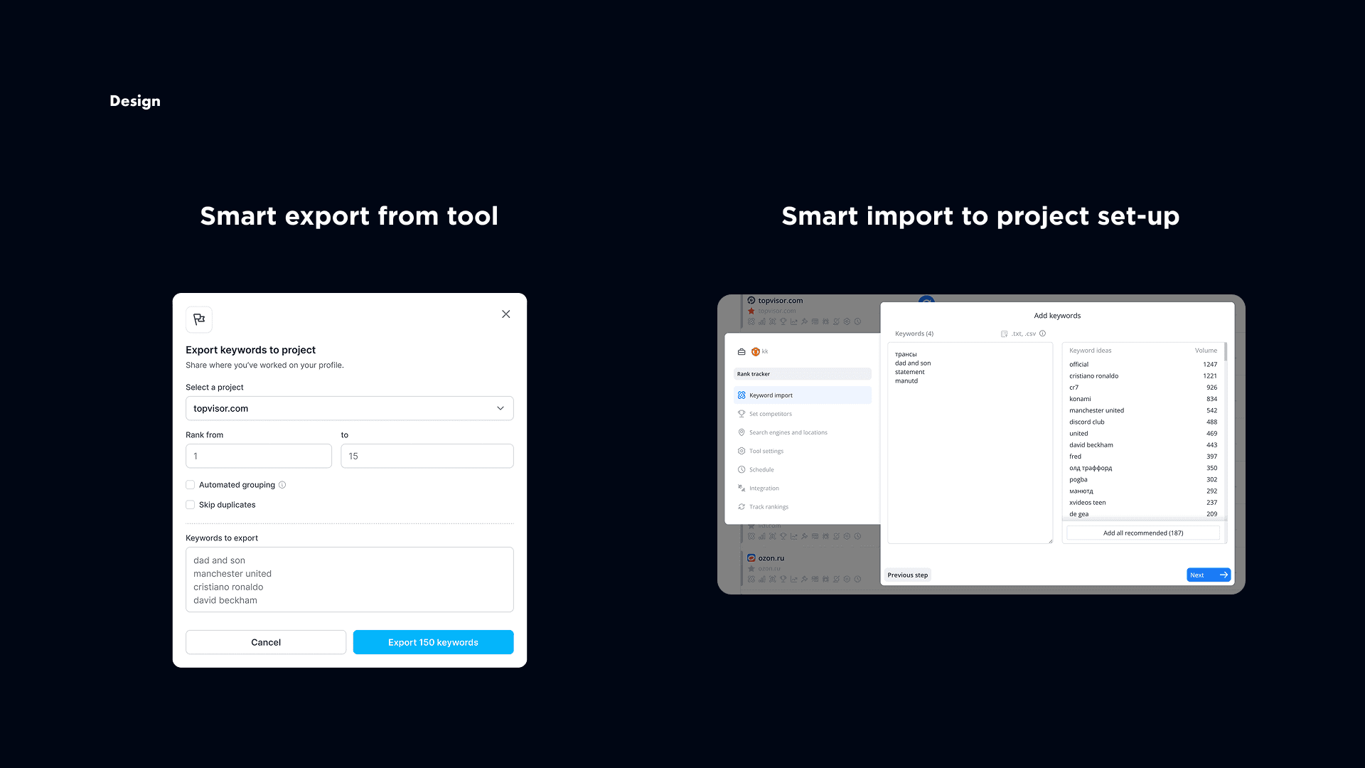
We also integrated the tool directly into Rank Tracker. Users could export selected clusters into Rank Tracker, and they could start a project using competitor data from the beginning. This removed the empty start and made the whole suite feel connected.
For the freshness limitation, we reframed the problem. Instead of hiding that data was monthly, we made the timeframe explicit and added trend views over time. So instead of promising “live” data, we helped users understand how competitor strategies changed month by month. What first looked like a limitation became a real product strength.
Mobile
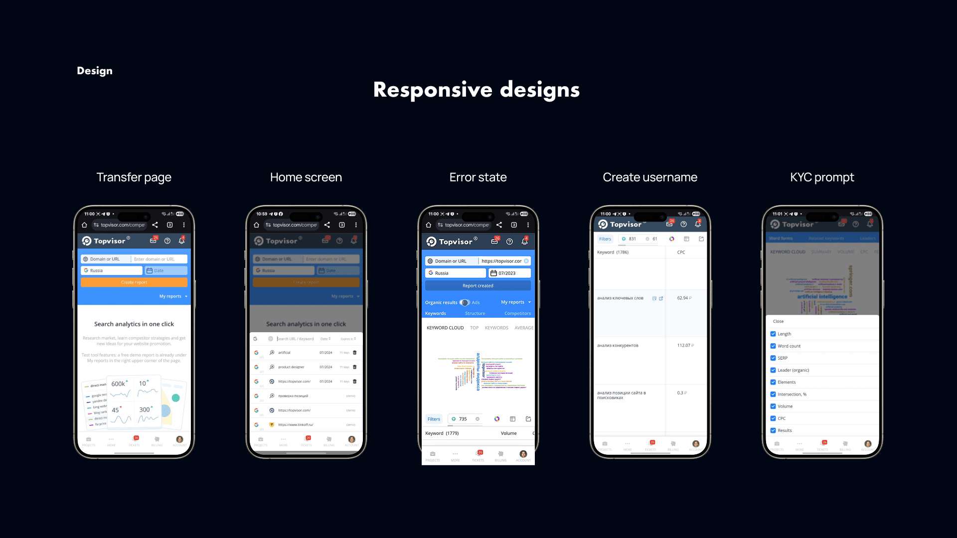
Topvisor had always been responsive, and that was one of its advantages over competitors. So from the beginning, this tool had to work well on mobile too.
That meant rethinking how to handle filters, large datasets, and visual summaries on smaller screens. I used collapsible sections, progressive disclosure, and lightweight graphs to make the experience usable without losing depth.
This paid off. Agencies could quickly show competitor insights to clients from their phones, and small business users could check keyword opportunities during the day. Mobile usage became an important part of adoption.
Impact
We measured success through internal dashboards and Google Analytics, so we could track activation, drop-off points, and adoption.
Within the first month, activation improved significantly because users were no longer getting stuck during project setup.
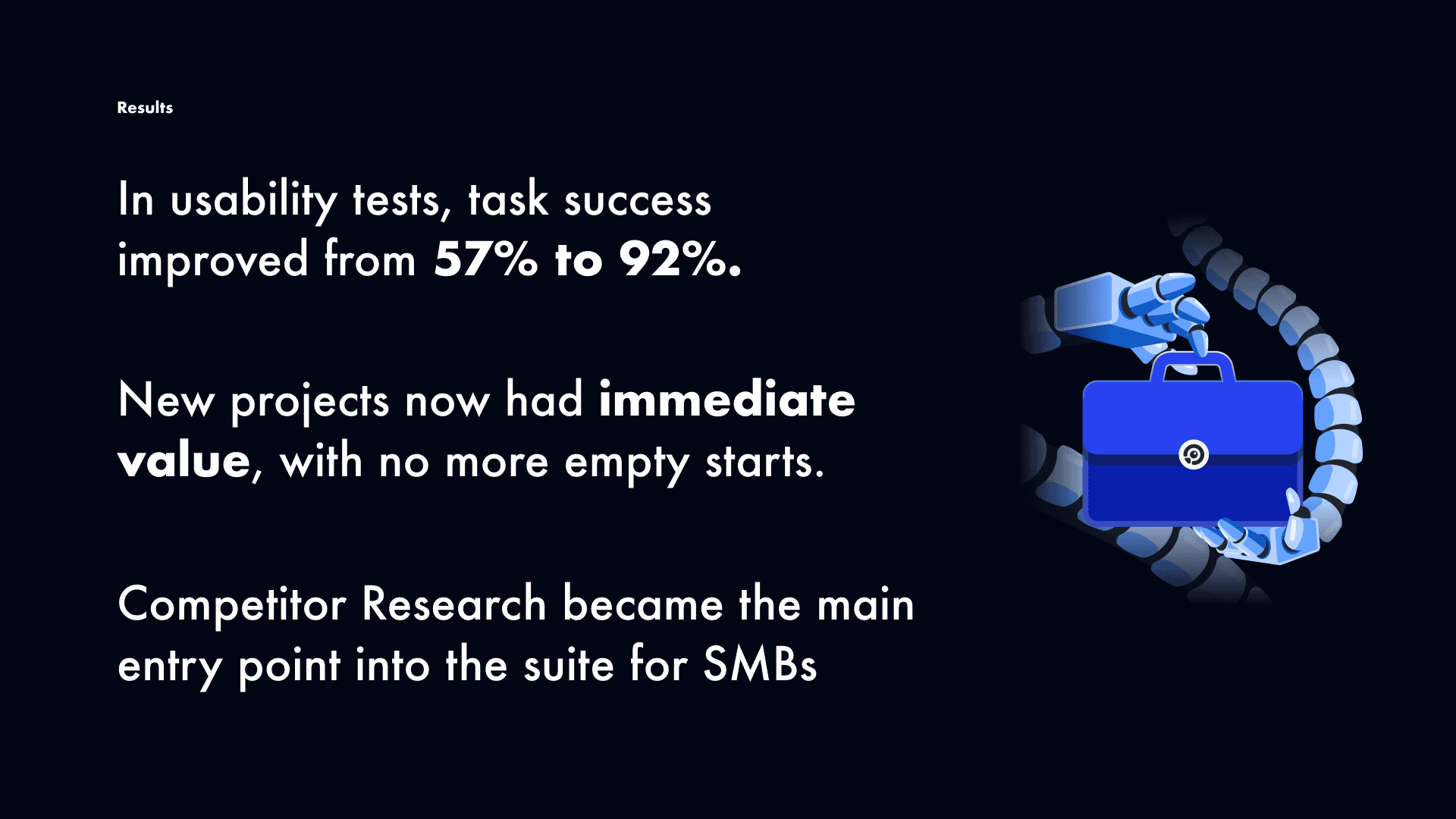
In usability benchmarks, task success increased from 57% to 92%.
Competitor Research became one of the main entry points into the suite, and support requests like “I don’t know what to put here” almost disappeared.
We also continued gathering feedback after launch from both stakeholders and users, which helped us understand not only that the tool worked, but why it worked and what to improve next.
Learnings
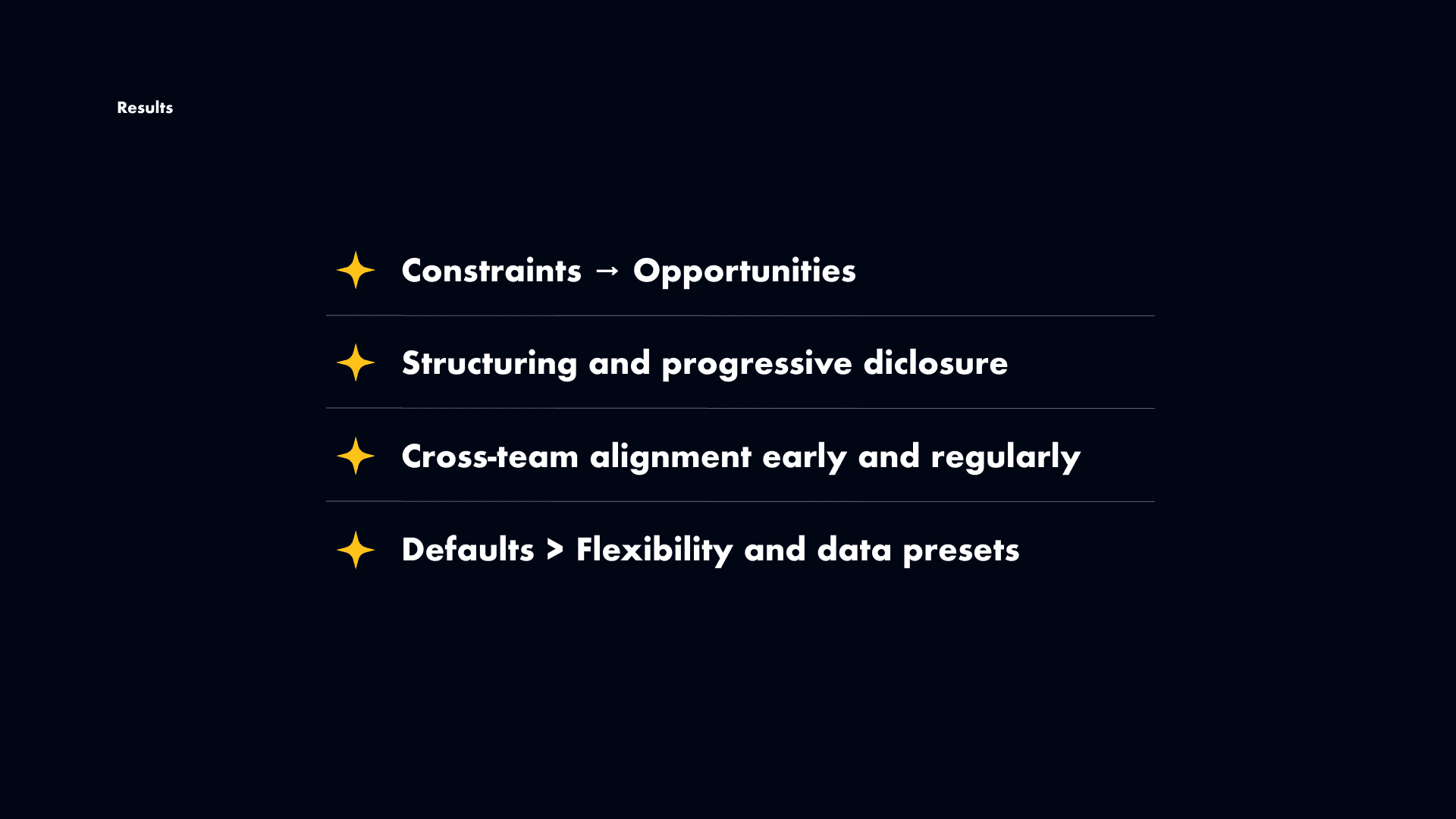
This project taught me three important things.
First, constraints can create better products. We couldn’t deliver live data, but reframing that limitation into trend analysis made the product more useful.
Second, massive tables are not a good default — even for advanced users. Clustering, progressive disclosure, and smart filtering became essential, not optional.
And third, strong defaults matter more than unlimited flexibility. SMB users didn’t want endless options. They wanted a clear starting point. Once we simplified the experience for them and kept depth for specialists, satisfaction improved.
For me, this project was a strong example of balancing different personas, working closely with engineering and product, and turning technical constraints into meaningful design decisions.
—-
Build and export structured reports without formatting manually
Analyse graphical data, tables
Filter and view report on user's terms
And do it all on the mobile as well